Alley Cat Advocates
Refreshing the brand as they settle in their new location.
(pro-bono)
4 months
August—December
Brand Designer
CONTEXT
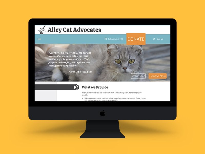
Let’s Refresh.
Alley Cat Advocates is a non-profit organization that aims to Trap-Neuter-Return cats most humanely and effectively to stabilize and reduce the unowned cat population. A brand refresh was needed after the organization moved to a new location to better distribute its services. For the class “Design for Public Issues,” designers were teamed up in groups of 4-5 to help a non-profit organization refresh, redesign, or rebrand their organizations, depending on their need for our assistance. This project spanned over an entire semester.

PROBLEMS
Two Concepts, One Choice.
The goal was to create a new, consistent, visual system for Alley Cat Advocates while addressing some of the issues that were set in place for the organization:
Vague Communication
The organization lacks outreach to attract new potential donors, so it must clearly communicate its goals to sustain its efforts. Vague messaging about its services results in confusion.
Confusing Message
Their main goal of increasing awareness of the Trap-Neuter-Return (TNR) program for stray cats is lost within the messages and campaigns of their brand.
Outdated Visuals
Hard to follow visual designs with digital assets and have no straightforward visual design for the physical assets of their brand.
Challenge
Create a new visual system for Alley Cat Advocates by giving the current brand in place a refresh while introducing the organization to new potential donors to increase donations, increase awareness, and continue a sense of community.
Design Solutions
Concise Communication
Smaller, quicker communication of what organization they are at a quick glance.
Inviting Visuals
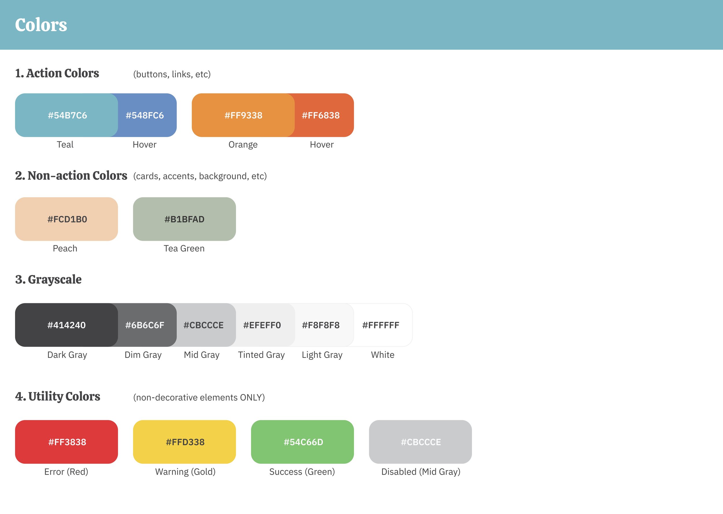
Reoccurring color palettes and overall illustrative look to welcome new volunteers and audience.
Community Involvement
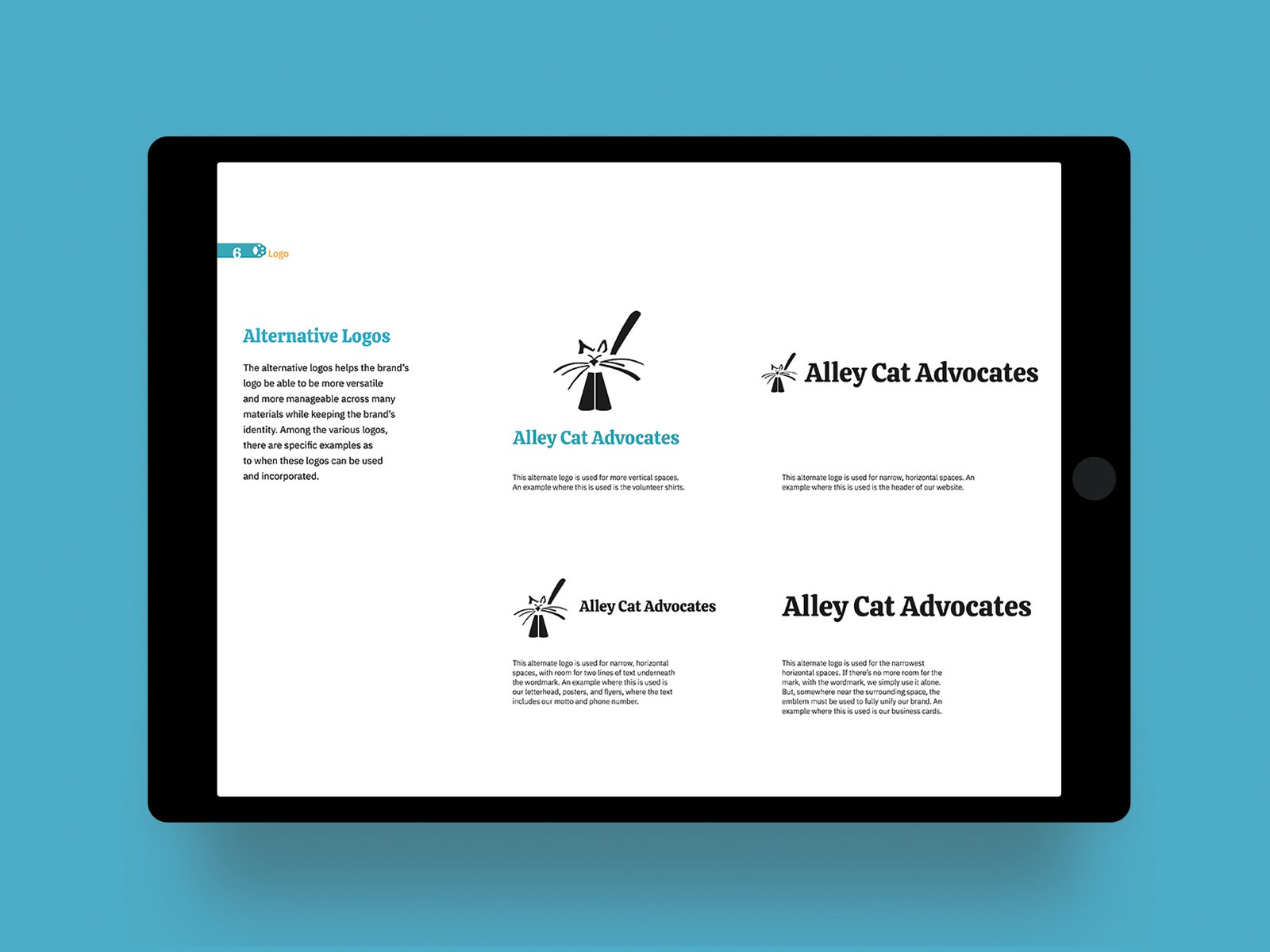
Keeping the original logo, slight changes and multiple orientation creations were done to make the logo and brand versatile of different types of uses.


GROWING PAINS
Two Designs, One Choice.
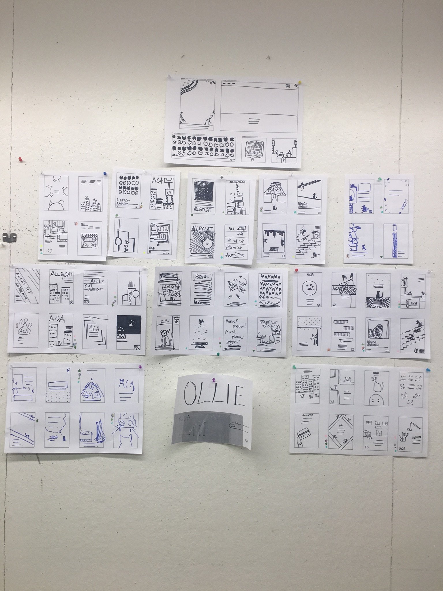
Two directions were considered after the initial meeting with the organization's director, and empathy and journey maps were created to decide on the brand direction. Option A was more of a modern, geometric approach to their brand, going for darker, earthy tones for the professional side of the brand. Option B was friendlier and warmer, with vibrant, illustrative colors to help create an inviting look for prospecting newcomers, volunteers, and sponsors to approach them. A refresh of the logo was also considered.


Current version of the logo (top left) compared to redesigned logo (top right and bottom)old designs with the current logoNeed to create one more moodboard to combine the two to better represent Alley Cat Advocates and their overall message.
Current logo needed to be in place as new location was already redecorated before the semester project was announced and finished.
Lack of organization with their content to better provide service and information to new potential volunteers and donors.
Further discussions and clarifications brought a more narrow focus to refreshing the surrounding materials surrounding their advertisements, website, visuals, and promotions of their brand while creating a brand stantards for their organization.
Patching things up.


When presenting the two options to the client, they couldn’t decide which one to choose. They liked certain aspects of both moodboards, so as a collective, we decided to merge the two together. When it came to the logo, they liked the idea of the refresh, but a few issues had been raised: the current logo was made by a friend of theirs, and they already decorated the new location with the current logo they had.
Pinpointed issues.
Option A: OllieOption B: Sally


Regular creations of the posters for non-anniversary years highlight all types of skates, from beginner skaters to professional skaters, from 3 years old to 60+.
The 20th-anniversary posters were inspired by Taylor Swift’s era tour posters to celebrate a variety of the Claras that participated in past productions.
Logo
Addressing specific needs and versatility in the organization's deliverables to mark its brand and makes it more recognizable.


Small flyer handouts advertise the show during public ice sessions inside the facility or at outside ice rinks around Louisville, such as Paristown. The skaters skate on public ice or have a small show in Paristown to garner awareness among newer audience members for the actual show.
Brand Elements

Promotes actual visuals of the show with condensed information for the event.
Encourages skaters to engage inside and outside of the community to showcase their performances.


Small flyer handouts advertise the show during public ice sessions inside the facility or at outside ice rinks around Louisville, such as Paristown. The skaters skate on public ice or have a small show in Paristown to garner awareness among newer audience members for the actual show.
Posters & Flyers
Promotes actual visuals of the show with condensed information for the event.

Encourages skaters to engage inside and outside of the community to showcase their performances.


Small flyer handouts advertise the show during public ice sessions inside the facility or at outside ice rinks around Louisville, such as Paristown. The skaters skate on public ice or have a small show in Paristown to garner awareness among newer audience members for the actual show.
Printed Materials
Promotes actual visuals of the show with condensed information for the event.
Encourages skaters to engage inside and outside of the community to showcase their performances.

Small flyer handouts advertise the show during public ice sessions inside the facility or at outside ice rinks around Louisville, such as Paristown. The skaters skate on public ice or have a small show in Paristown to garner awareness among newer audience members for the actual show.
Volunteers
Promotes actual visuals of the show with condensed information for the event.

Encourages skaters to engage inside and outside of the community to showcase their performances.
Small flyer handouts advertise the show during public ice sessions inside the facility or at outside ice rinks around Louisville, such as Paristown. The skaters skate on public ice or have a small show in Paristown to garner awareness among newer audience members for the actual show.
Brand Elements
Promotes actual visuals of the show with condensed information for the event.
Encourages skaters to engage inside and outside of the community to showcase their performances.
LOOKING AHEAD
Retrospective
MEASURING SUCCESS
Promoting the show with posters increased the facility's awareness of the event by 73%, garnering more attention to the show. Public pop-up shows with advertisements reached 35% more awareness. The show itself reach a 21% increase in sales.


Clothing merchandise for the cast members of the show, volunteers, and guardians of the members.For reels and social media posts, highlighting the theatrics of the show and skaters’ potential garners excitement and interest for new customers.
Project takeaways.
Passive to Active— Good design often goes unnoticed and unspoken, but exceptional design or a shift in approach fosters conversation, which is essential for growth and change. Gaining public attention doesn’t initiate change, but appealing to the hearts of skaters and their guardians through the posters created a sense of gratitude and movement within the design itself. This inspired a proactive community to keep the tradition of producing these posters alive.
UX in Real Life— Creating social interaction with design marks the user experience for both the consumer and the skaters involved in the advertisements. Designing for communication and showcasing a community can be the passive product of the user experience aside from the UX we know digitally.
A Picture is Worth 1,000 Words— Simple is best in designs like these, where the main visuals come from the skaters themselves with visual hierarchy in typography. There were times when making complex designs made it harder for the audience to see what the show truly was for, so stripping the distracting elements and honing all the focus on the sport itself was key.
