Learn to Skate
A refresh of the marketing materials,
introducing newcomers to the world of ice skating.
Louisville Skating Academy
4 months
December 22, 2024
Graphic Designer

CONTEXT
A visual approach to figure skating.
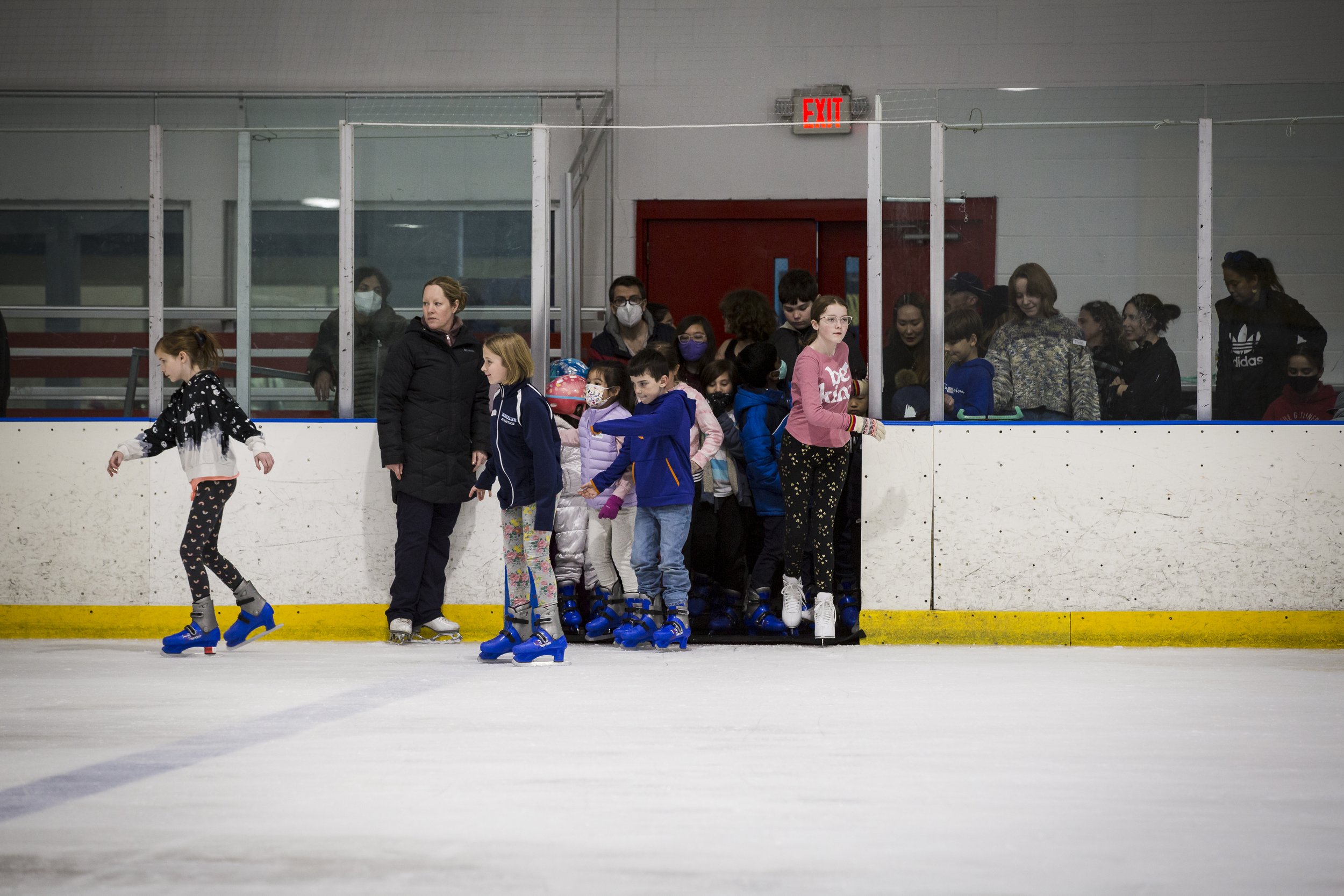
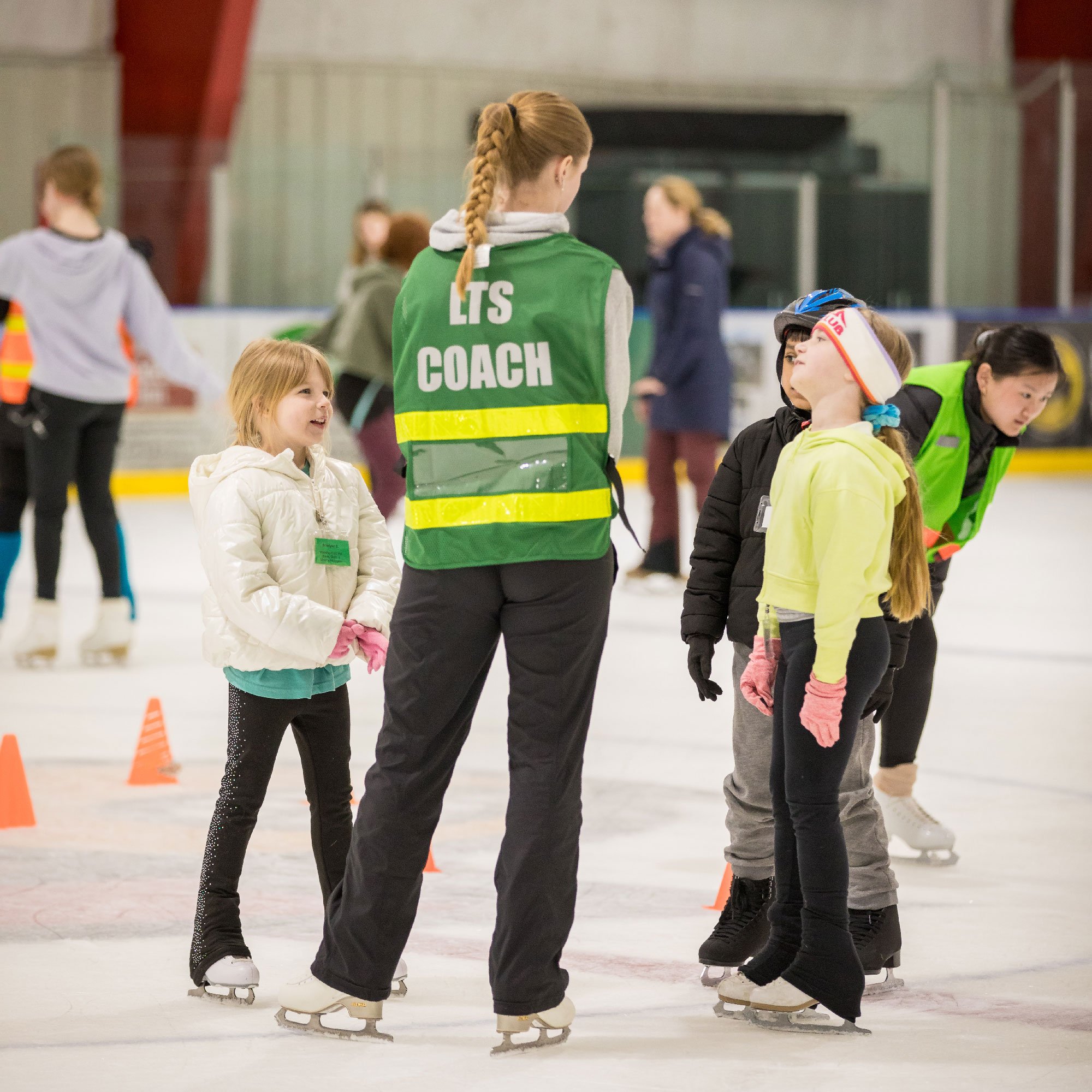
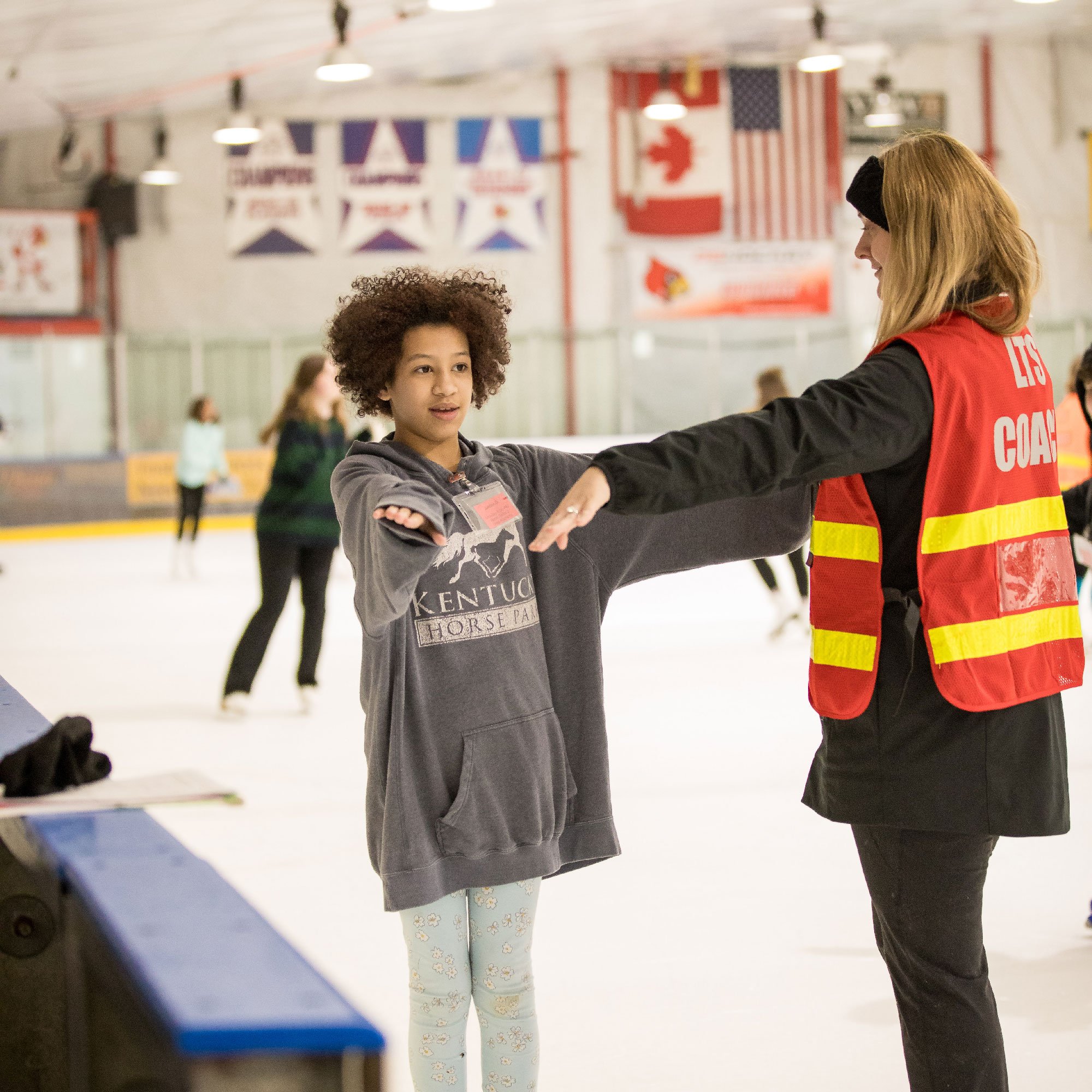
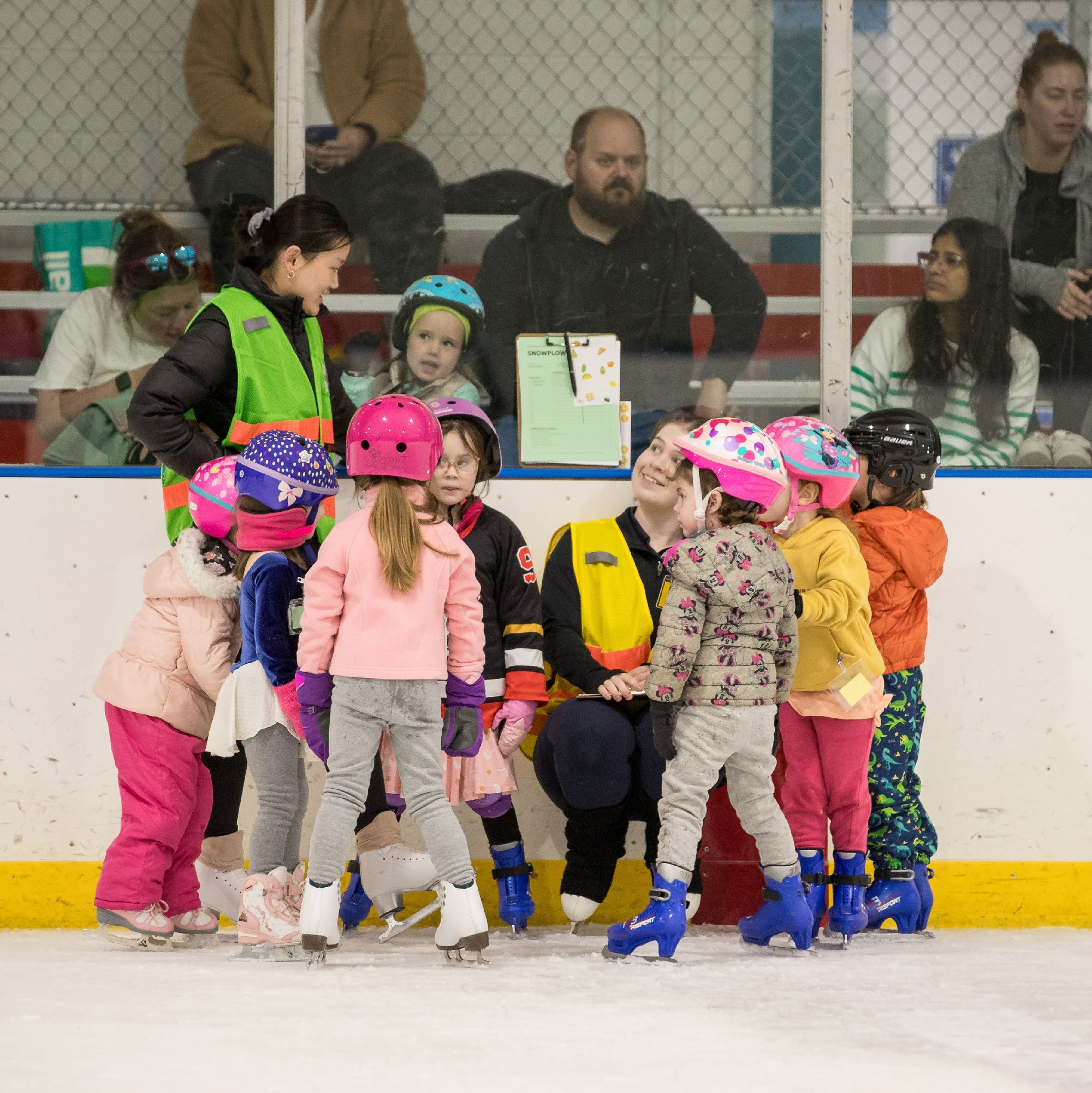
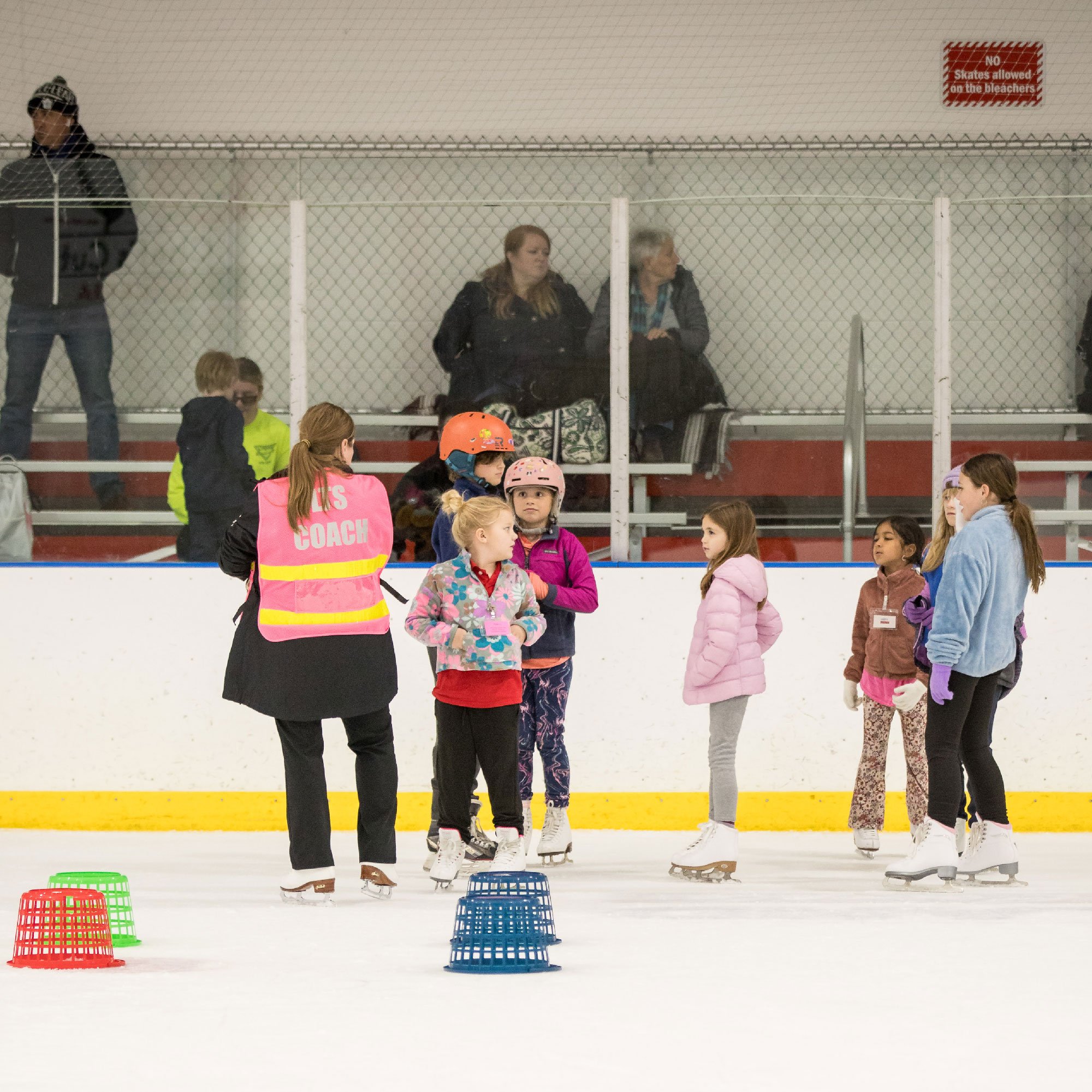
Learn to Skate (LTS) is Louisville Skating Academy’s entry-level program that teaches people of all ages and abilities the fundamentals of ice skating. The program is the first step before moving into private lessons or joining show productions like Nutcracker on Ice. Despite its importance, LTS had limited visibility in the rink. Most new families heard about the program through word of mouth, and existing marketing materials were either outdated or overwhelming.
PROBLEMS
If I can’t see it, I don’t know about it
Through initial interviews with skaters’ guardians, several issues emerged:
Minimal Promotion
Most families only learned about LTS from coaches or other parents.
Weak Presence
Display boards were cluttered, outdated, and confusing.
Missed Audience Reach
Materials weren’t designed to attract casual public skaters and passersby.
Challenge
How might we redesign LTS marketing to capture attention inside the rink, communicate essential information clearly, and convert public skaters into program participants?
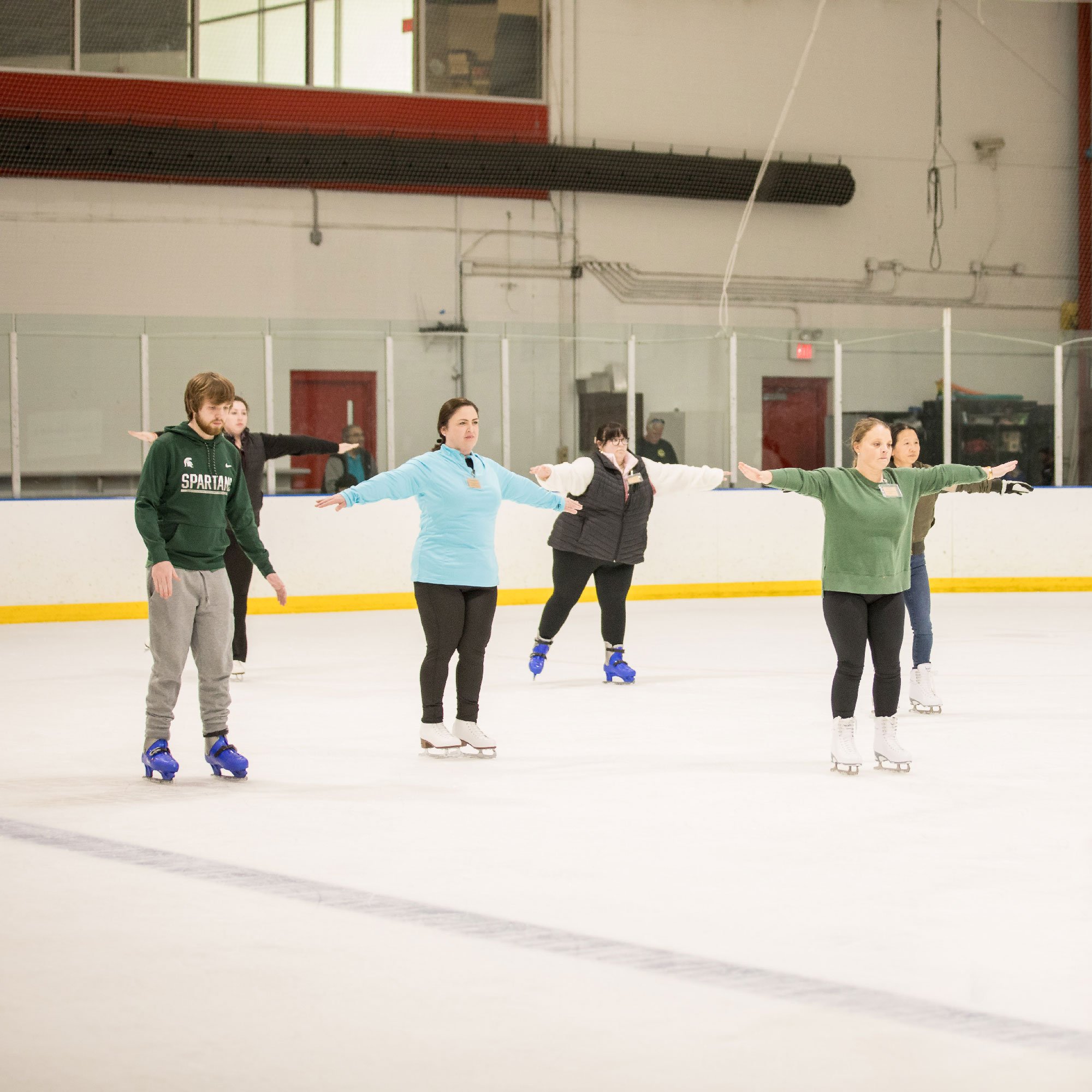
Design Solutions
Visibility
Strengthen LTS’s presence inside the rink with engaging materials and keep newcomers engaged.
Clarity
Condense program details and FAQs into simple, scannable formats.
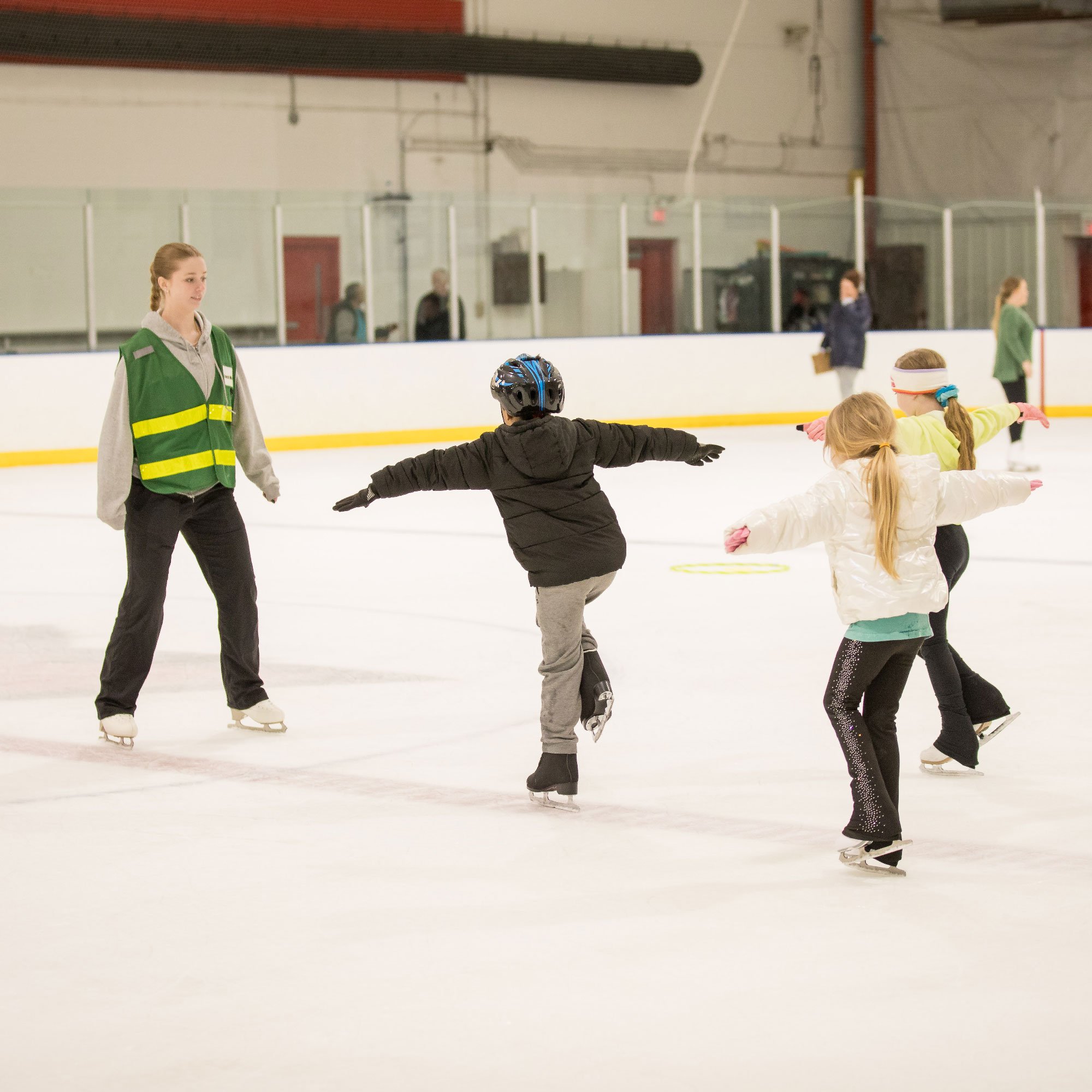
Community Connection
Showcase real skaters to inspire newcomers to join the LTS program.
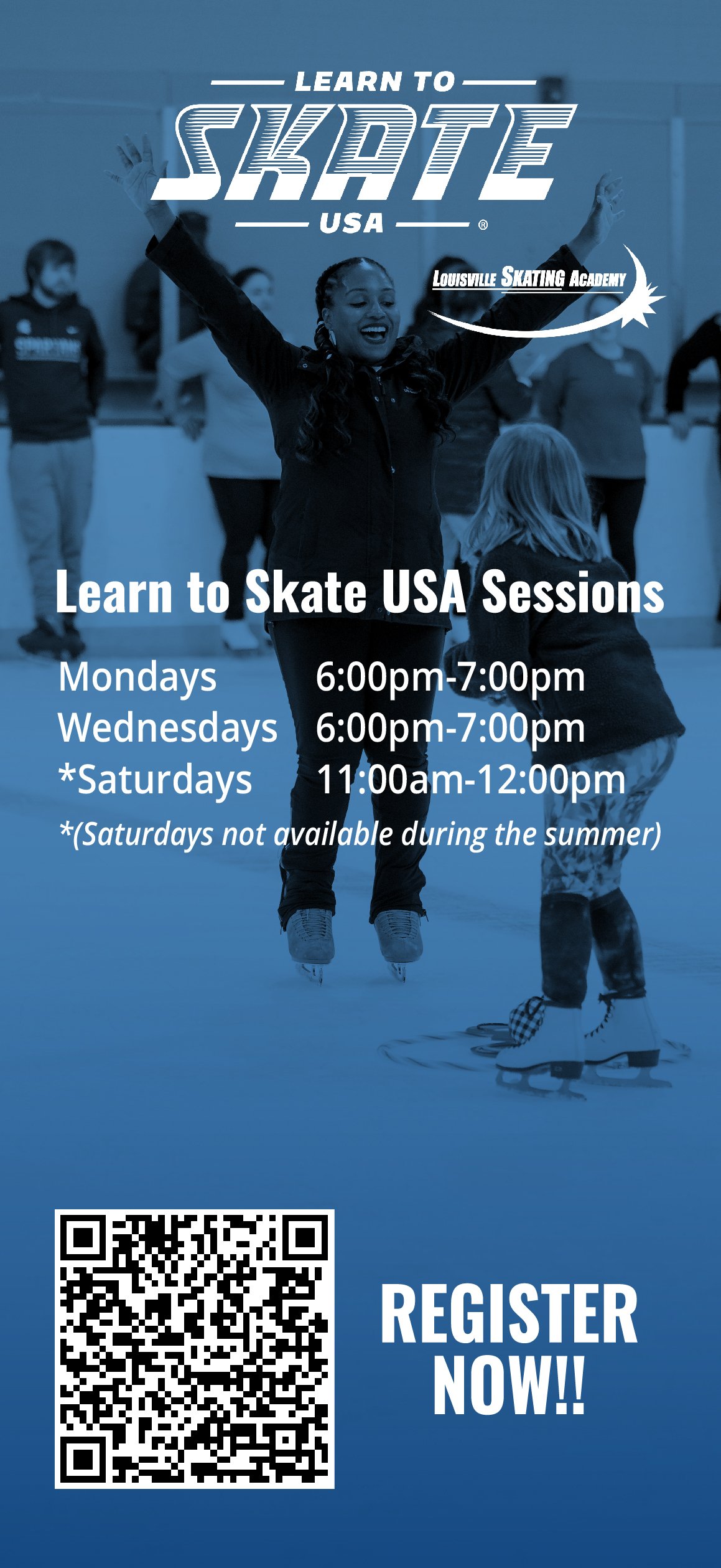
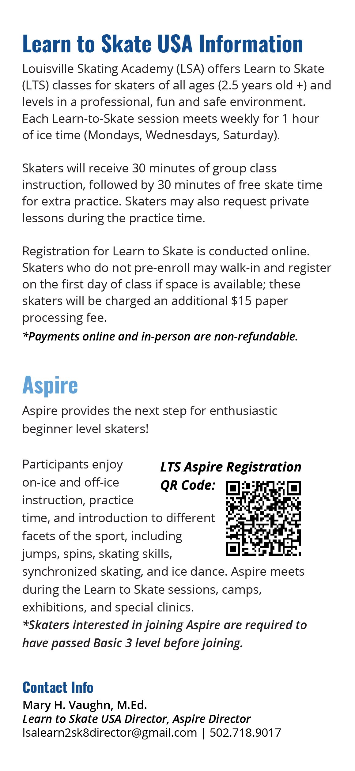
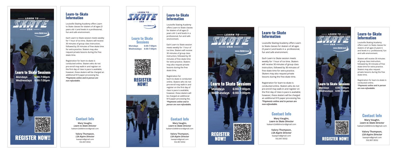
Designed flyers in bookmark format to make them easy to pick up at the front desk. Condensed program details and FAQs into a minimal, portable layout that families could take home. Distributed during public skate sessions for maximum reach.
Bookmarks
Designed over 5,000+ bookmarks distributed during skating seasons.

CAPTION
CAPTIONRevamped the rink’s LTS display case with a cleaner layout, action photography, and updated content. Improved information hierarchy so newcomers could quickly grasp what LTS is and how to join.
Display Boards
After the redesign, 78% stopped reading, with 41% returning to the desk for a flyer/bookmark.
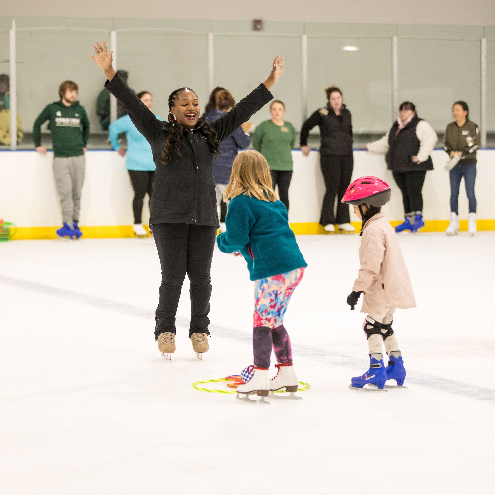
Girl Scout Day & Learn to Skate

Designed shirts and miscellaneous for Girl Scouts to wear and take gift bags home for the day after the Learn to Skate program hosted an event.

Left: complimentary shirts
middle: girl scout skating
right: girl scout goodie bags
Bottom: girl scout day freeskate

LOOKING AHEAD
Retrospective
MEASURING SUCCESS
Retention time on boards increased from 43% → 78%, showing higher engagement for display baords and users grabbing the printed materials.
Sports and design are a natural fit, and this project deepened my interest in designing for sports and entertainment spaces, blending visual identity with real-world usability.
Project takeaways.
Environmental UX is powerful— Even physical boards and flyers can be optimized for attention, clarity, and retention.
Iteration matters — Boards were continually redesigned each year to stay relevant and engaging.
Design fuels community growth — Flyers and displays not only attracted newcomers but also reinforced pride among existing skaters.
