Nutcracker On Ice
A visual overhaul for the annual Nutcracker on Ice winter show production, promoting the show to new audiences.
Louisville Skating Academy
2 months
October - November
Graphic Designer, Art Lead

CONTEXT
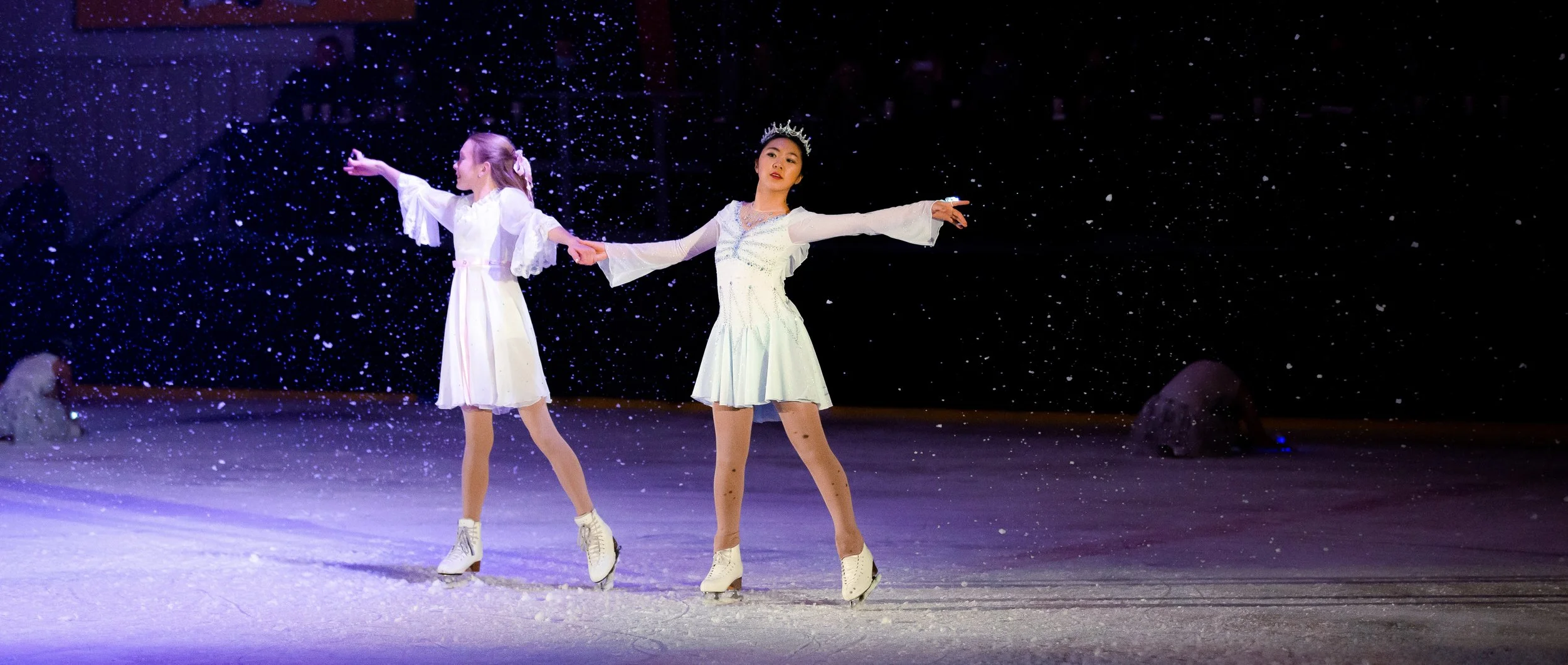
A visual approach to figure skating.
The Nutcracker On Ice is an annual winter show production presented by the Louisville Skating Academy, a non-profit figure skating organization. The visual redesign aims to showcase more of the show style of figure skating, creating a brand that shows the skaters in the community and inspiring more people to try figure skating and participate in the show.
PROBLEMS
More designs, more choices.
Louisville Skating Academy’s outreach was very limited, which created a set of issues:
Limited Public Ads
Advertisements for the shows were non-existent to help promote the show. This created a lack of new audience and communication between the organization and public ice skaters.
Lack of Rep In-Building
Seeing the Louisville Skating Academy members’ involvements in action was lacking during the time of promotion for the show. A lot was happening behind-the-scenes, but more of the public visuals leading up to the show were non-existent.
Narrow Audience
Audience members are mostly the skaters’ families coming in to watch their relatives skate. This creates a limited reach for newer, potential skaters to join for the next year’s production or to simply watch the show.
Challenge
Create more of an outreach for newer, potential audience members and skaters to watch the show. Hopefully, this will also funnel in newer customers to join the Learn To Skate program to eventually join the next year’s production and increase the community.
Design Solutions
Utilize Visuals
Using photography of skaters’ involvement in the show to help visualize the show and give a sneak peek of what the show will look like.
Quick, Digestible Info
Creating quick and easily readable information to quickly get the main information across about the shows. Help increase attention of the show within the holiday season during heavy traffics of public skating sessions to draw in new audience members.
Community Involvement
Involving Louisville Skating Academy’s members within the advertisements from the past year of shows helps incentivize the skaters’ involvement and performances in the show, creating a boost of morale, camraderie, and anticipation for the future show.
GROWING PAINS
In-Person Advertisements
A lot of traction comes from the holiday season, which runs from October through December. This garners many new consumers who could potentially convert to seeing the show and trying figure skating themselves. The lack of in-person advertisements to post up on the walls is a missed opportunity, which became the first step to build the brand’s visibility within the facility.
Old advertisements of the show included only business cards that were handed out to passerbys or shown at the entrance of the facilityAs the skating community grew, customers had a difficult time seeing the ads and knowing when the show was happening, hindering awareness of the event. Passersby wasn’t really sure what the event entailed, and by the time the promotion happened, most customers had pre-planned obligations to attend to.
Pinpointed issues.
Limited discoverability of the yearly event in the rink
Difficulty in understanding what the show entails
Lack of time to promote the event to get customers interested
To address the core challenge while maintaining the communal bond of the organization, a revamping of the advertisements was considered to draw in future customers. Working in tandem with a local photographer with their child as one of the figure skaters helps develop the visuals of the advertisements.
Using the previous year’s show as the visual focus for the next year’s advertisements created a passive community involvement for the show by using current skaters’ participation in the show.
Patching things up.

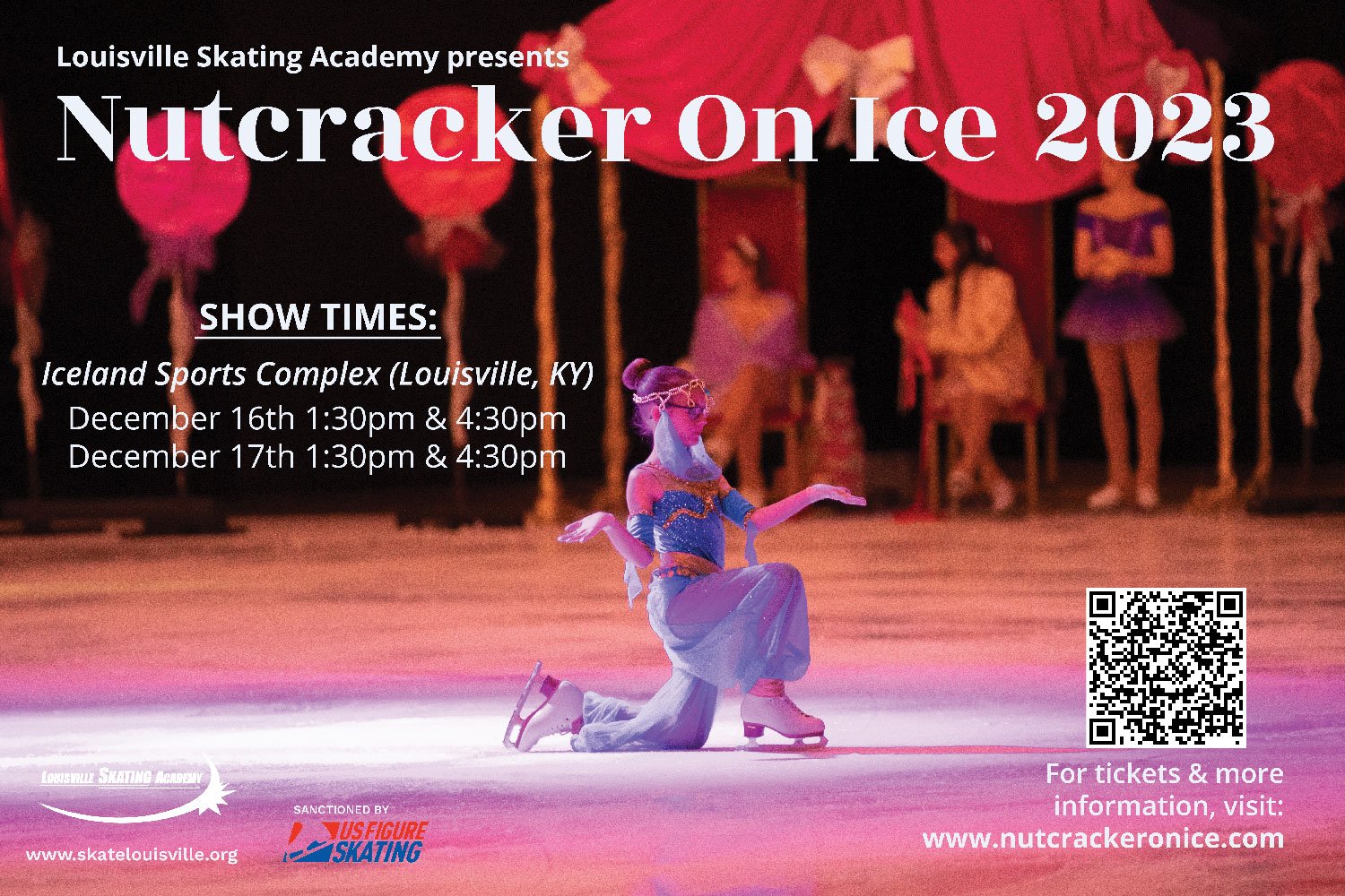
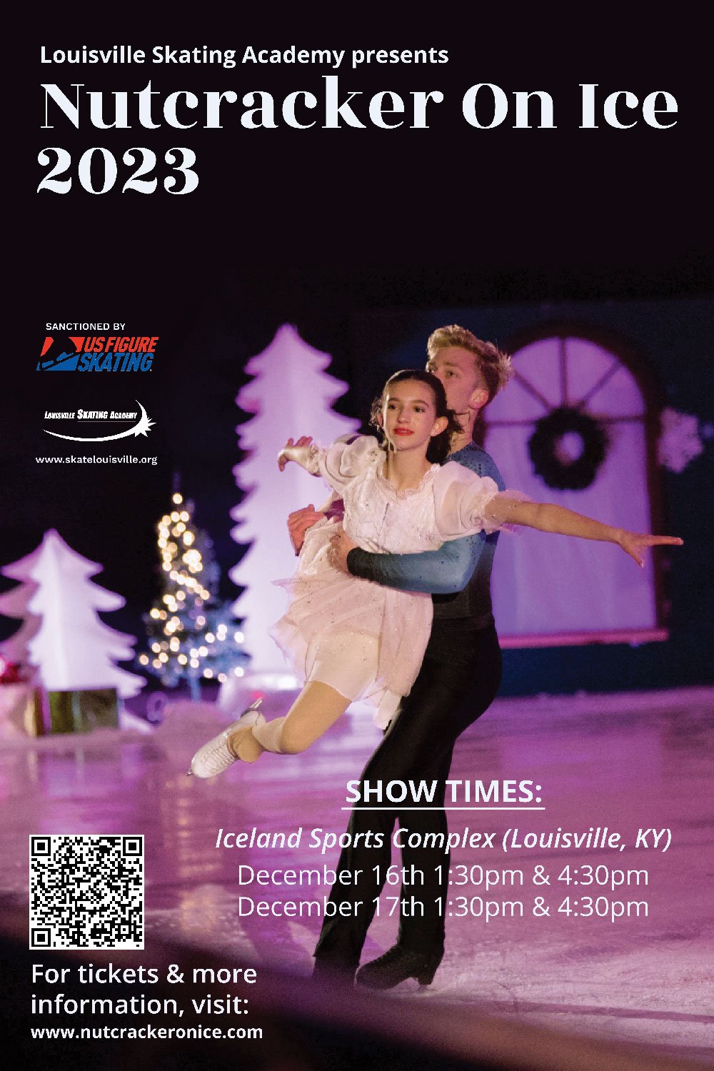

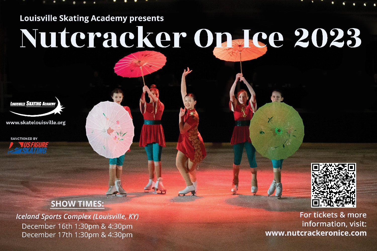


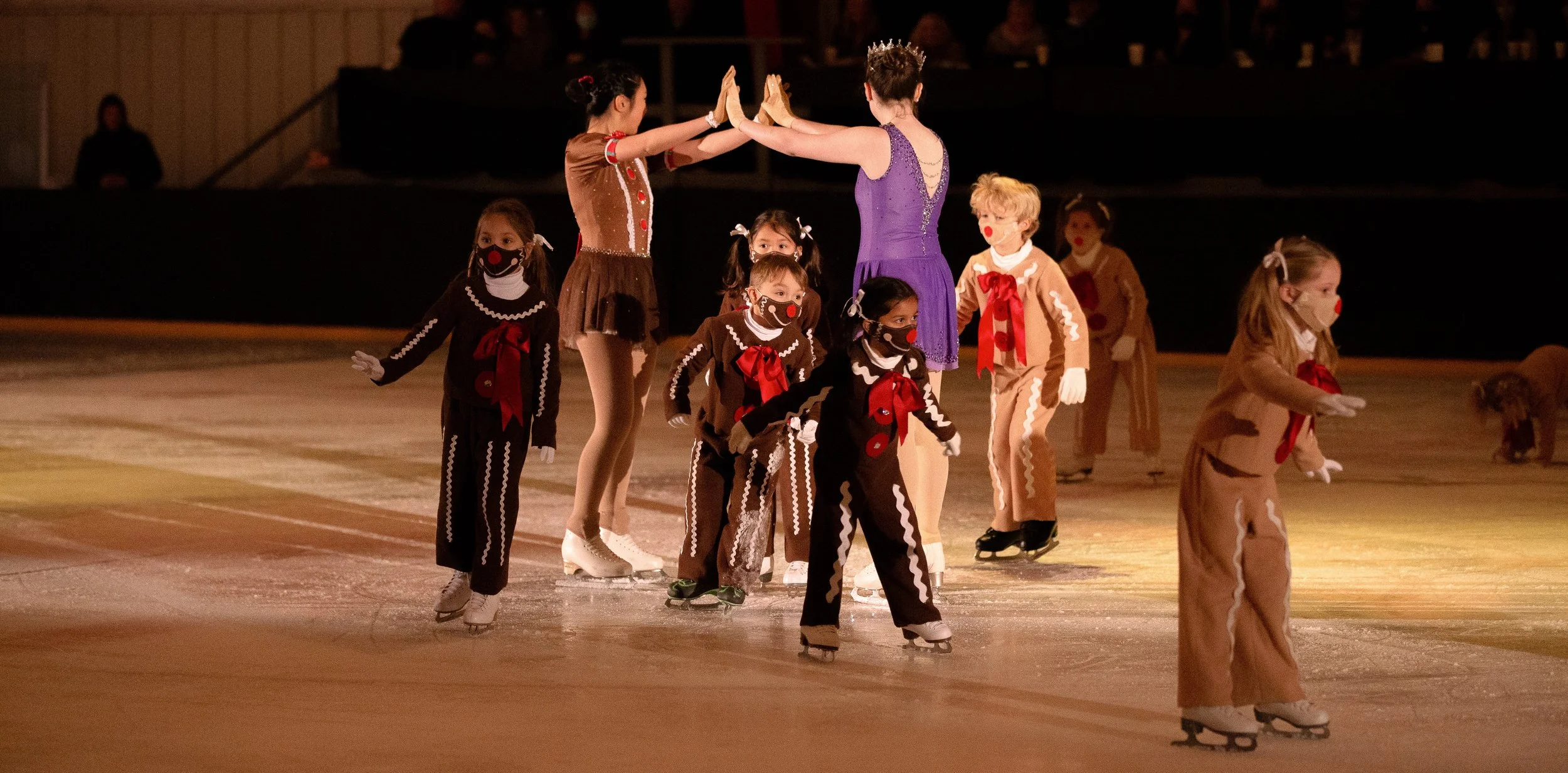
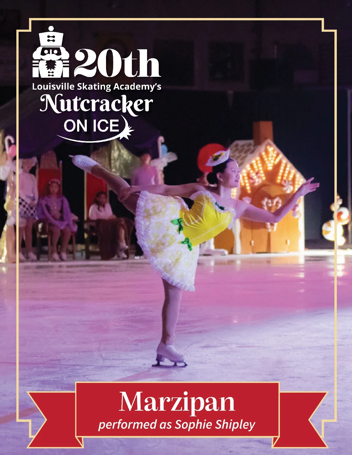
Regular creations of the posters for non-anniversary years highlight all types of skates, from beginner skaters to professional skaters, from 3 years old to 60+.
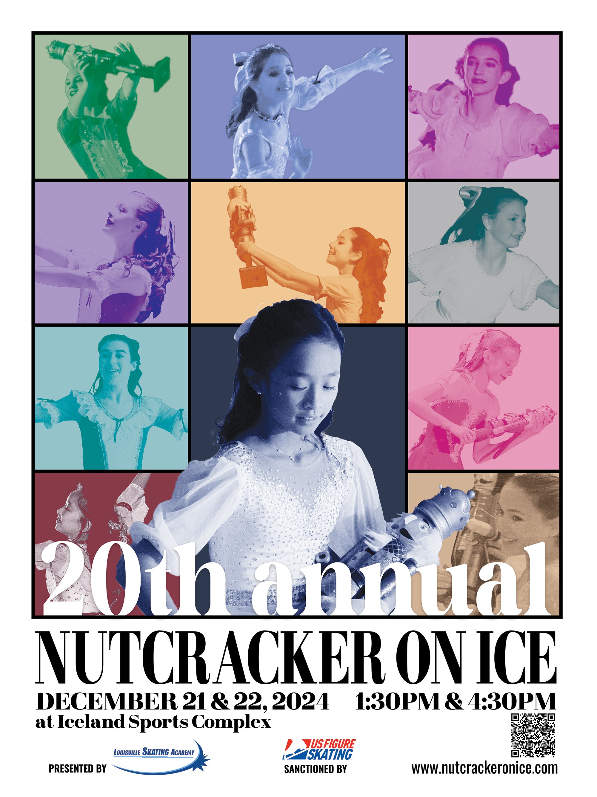
The 20th-anniversary posters were inspired by Taylor Swift’s era tour posters to celebrate a variety of the Claras that participated in past productions.
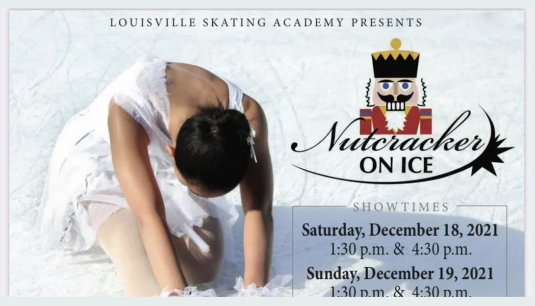
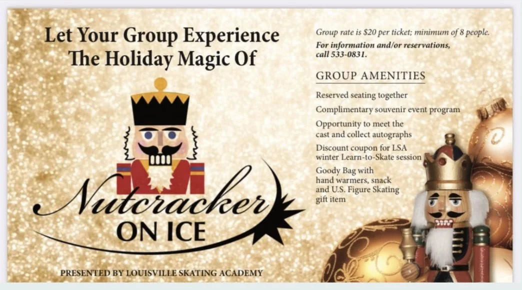
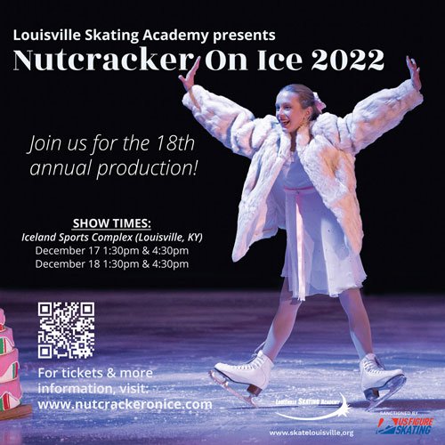
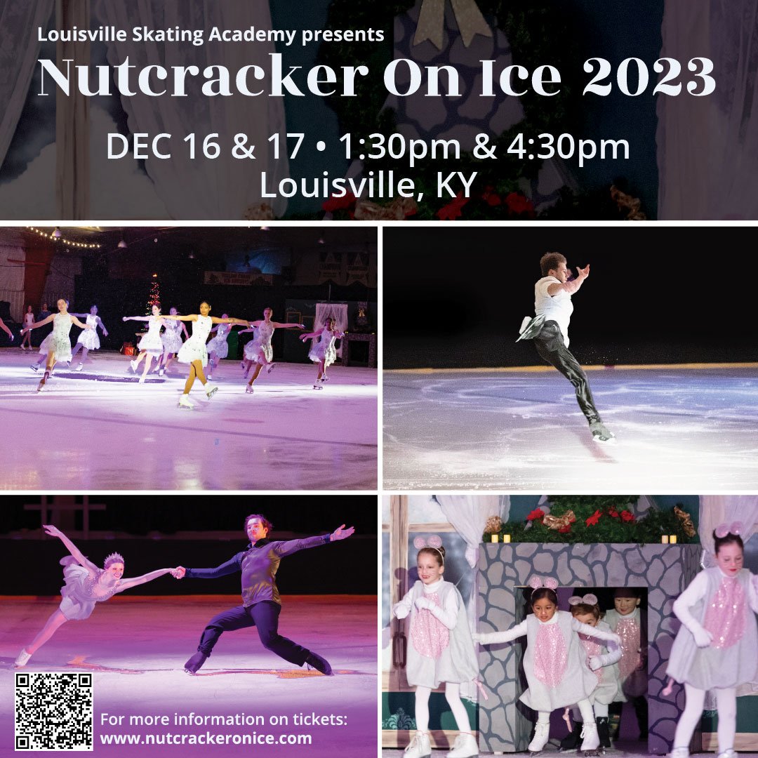
Posters
Highlighting all types of skaters who perform in the show creates an incentive for future skaters to participate and have themselves reflected in the posters for advertisements. These posters are shown inside the facility and various other locations where the organization does its pop-up shows.


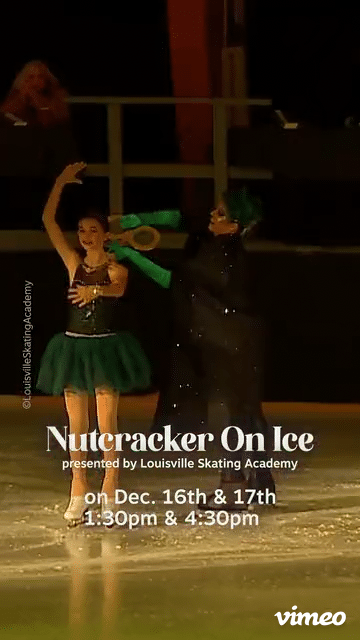
Small flyer handouts advertise the show during public ice sessions inside the facility or at outside ice rinks around Louisville, such as Paristown. The skaters skate on public ice or have a small show in Paristown to garner awareness among newer audience members for the actual show.
Small Flyers
Promotes actual visuals of the show with condensed information for the event.
Encourages skaters to engage inside and outside of the community to showcase their performances.
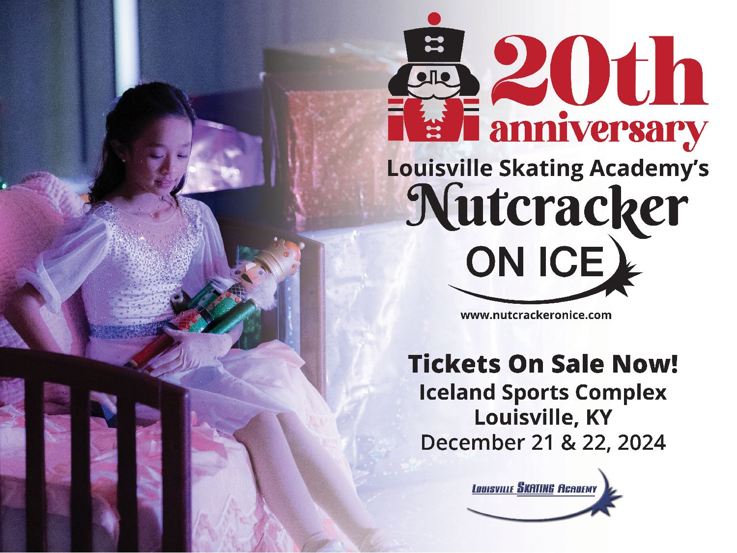
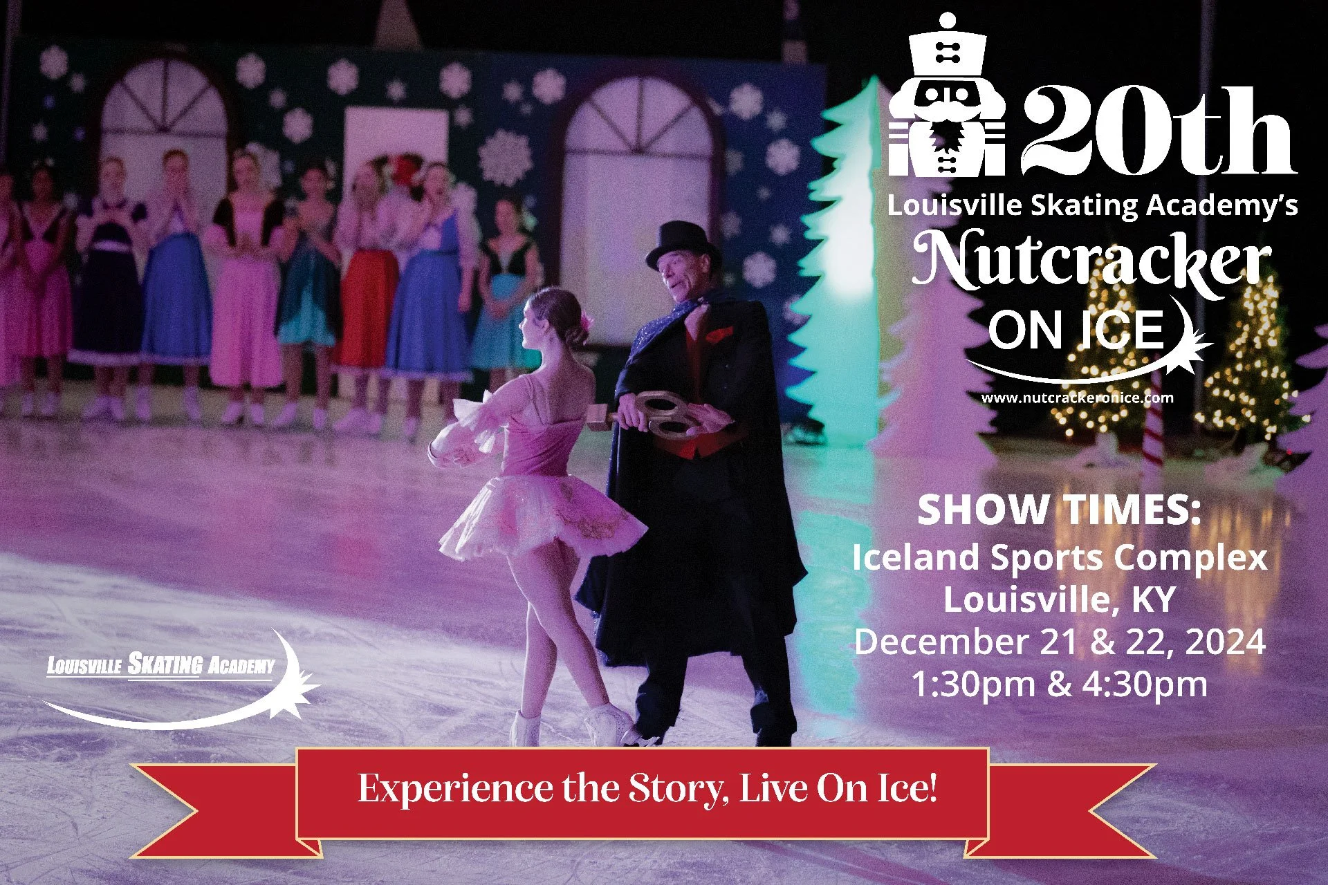

For the 20th anniversary, digital posts and prints were made to evoke nostalgia for the production's previous shows and show how far it has come. Physical prints were posted throughout the rink, leading up to the entrance where the show was held.
The quality of the production was an important factor in highlighting the organization's growth. High school seniors also received memory posts from their first Nutcracker role to their last one to show the longevity of their skating careers.
20th Anniversary
Updating the Nutcracker logo was another factor in redesigning the visuals of the brand. This makes the graphic more functional when used with the advertisements for brand visibility. The visuals from the skaters themselves take the focus, so the graphic being a tertiary element made for the revision of the logo to be one color.
Graphics

OLD LOGO FOR THE SHOWNEW LOGO FOR THE SHOWUnlocks more creative uses of the graphics, leading to flexible changes for advertisements and branding of the event.
LOOKING AHEAD
Retrospective
MEASURING SUCCESS
Promoting the show with posters increased the facility's awareness of the event by 73%, garnering more attention to the show. Public pop-up shows with advertisements reached 35% more awareness. The show itself reach a 21% increase in sales.


Clothing merchandise for the cast members of the show, volunteers, and guardians of the members.For reels and social media posts, highlighting the theatrics of the show and skaters’ potential garners excitement and interest for new customers.
Project takeaways.
Passive to Active— Good design often goes unnoticed and unspoken, but exceptional design or a shift in approach fosters conversation, which is essential for growth and change. Gaining public attention doesn’t initiate change, but appealing to the hearts of skaters and their guardians through the posters created a sense of gratitude and movement within the design itself. This inspired a proactive community to keep the tradition of producing these posters alive.
UX in Real Life— Creating social interaction with design marks the user experience for both the consumer and the skaters involved in the advertisements. Designing for communication and showcasing a community can be the passive product of the user experience aside from the UX we know digitally.
A Picture is Worth 1,000 Words— Simple is best in designs like these, where the main visuals come from the skaters themselves with visual hierarchy in typography. There were times when making complex designs made it harder for the audience to see what the show truly was for, so stripping the distracting elements and honing all the focus on the sport itself was key.