Edea Rebrand
An expansion from a packaging design project to a whole rebrand of Edea skates.
EDEA (CONCEPT)
1 year
April 2021
Brand Designer, Illustrator


CONTEXT
Made in Italy.
Edea is a skate company that creates man-made skates for figure and roller skaters, and their vision revolves around the athlete and focuses on the lightness of the skates. The mission was to create a rebrand that fit with the luxurious and expensive experience, as well as its values while maintaining its identity of skating.
PROBLEMS
Lightness means acceleration.
For the initial designs of the packaging design project, the main goal was to redesign the packaging:
Mixed Signals
The brand juxtaposes the visuals of the products, not conveying the products' value, experience, and emotions.
No Customer Experience
There’s no grand experience of getting the products, especially if it’s a monumental moment for the skater.
Hard to match
Skaters think of Edea mostly in terms of the skates' design, not the brand that encompasses the products. This creates a weak brand identity that does not match the products, making more of a brand vs product rather than a brand and product working together with cohesion.
Challenge
Establish a customer experience with the packaging design, while creating a unity with the brand’s identity in the process.
Edea is a brand that pushes for innovation and the experience of its products. Because of this, retaining its idea of elegance came to mind when rebranding the company to make it more recognizable, in addition to the skates.
Patching things up.
Limits the brand identity of the company as a whole
Lacks the elegance of the brand they’re trying to convey for the brand
GROWING PAINS
“The lighter the skates, the faster the athlete can be. Lightness means acceleration. Lightness means better skating. Lightness means Edea. The Italian vocation for elegance and years of family tradition guarantee that every shoe is treated in detail for years to come. Made in Italy.”
Lightness means better skating.

their designs of the skates: ice fly
Edea photo shots of the skaters
edea's packaging design for their skatesTheir old logo utilized red and black to signify that they were a sports brand for skates, yet their products didn’t display much red color. The colors of Edea’s skates tended to be in gold, silver, bronze, and grayscale, which was transferred in the logo rebrand to create a stronger identity for the brand.
Pinpointed issues.
Lightness means Edea.
After the packaging design project leading up to the last semester of college, I decided to go back and revamp this into a full rebrand of Edea:
Elegance & Luxury
This makes Edea more representative for skaters to notice its products while showcasing its luxuriousness and high-end visuals.
Quick, Digestible Info
Edea ensures that an exciting moment for the skater when they receive the package matches the expensive products waiting inside the packaging.
Strong Identity
Matching the presence and feeling with the brand and the products creates a more harmonious unity with the overall brand presence.
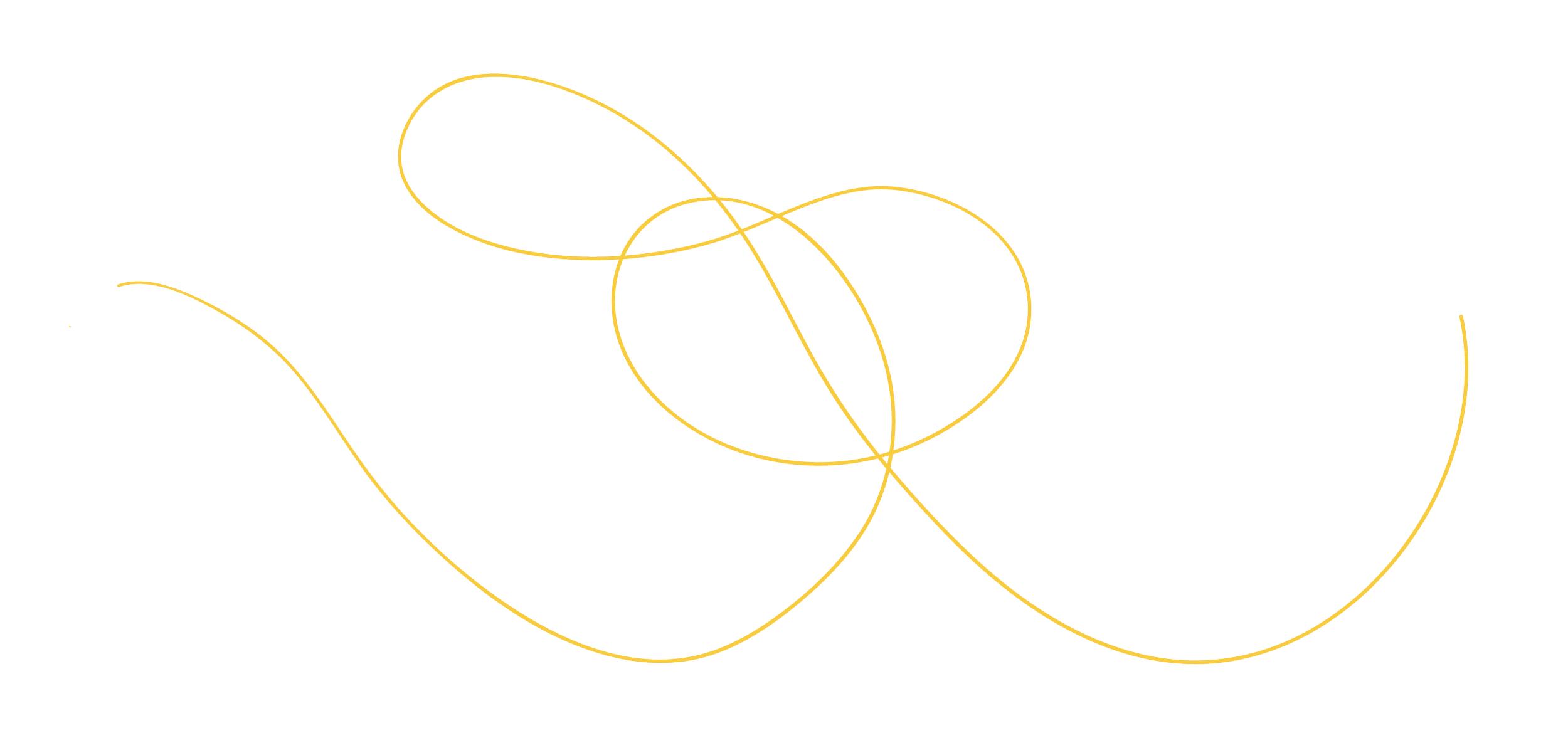
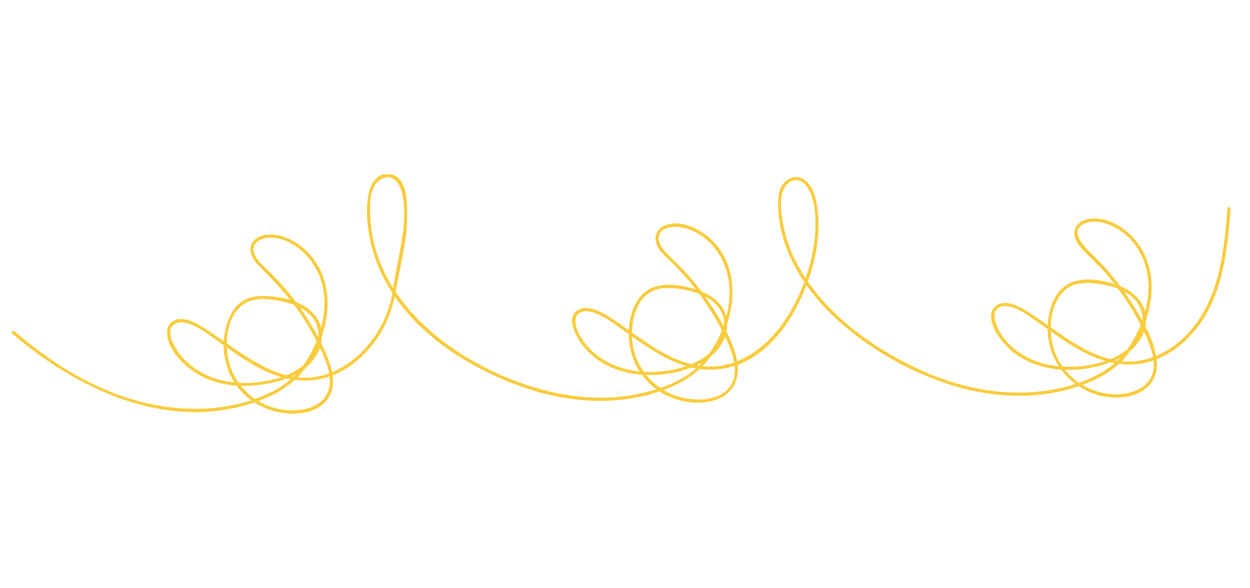
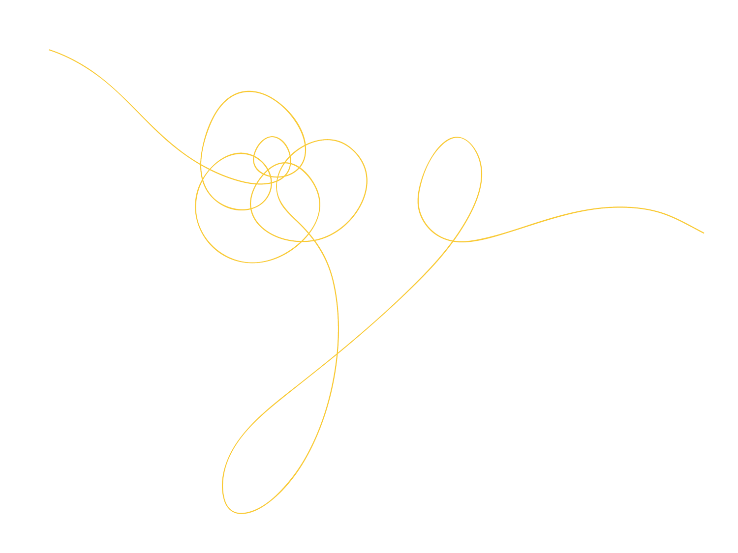
Illustrative
Line Designs
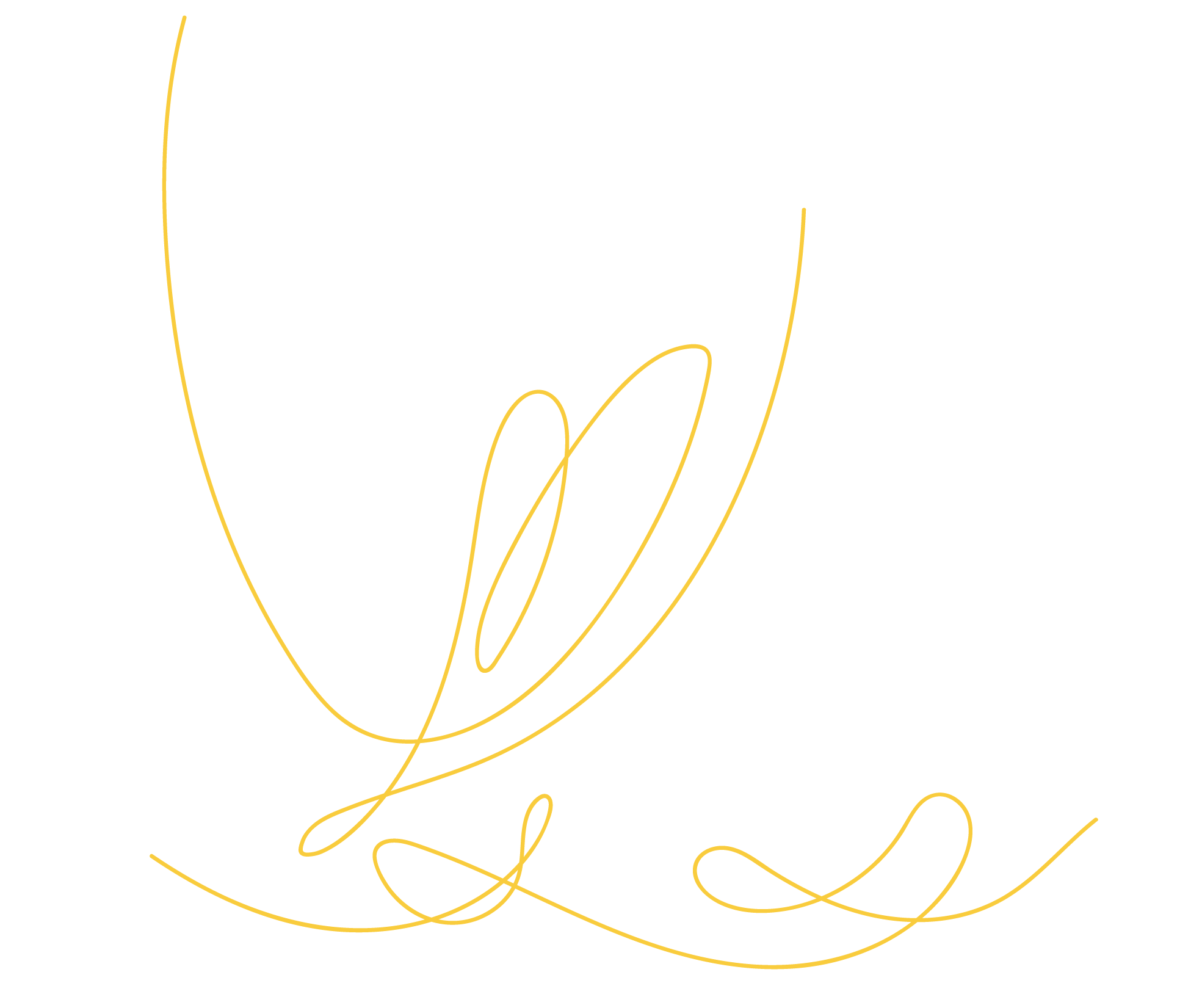
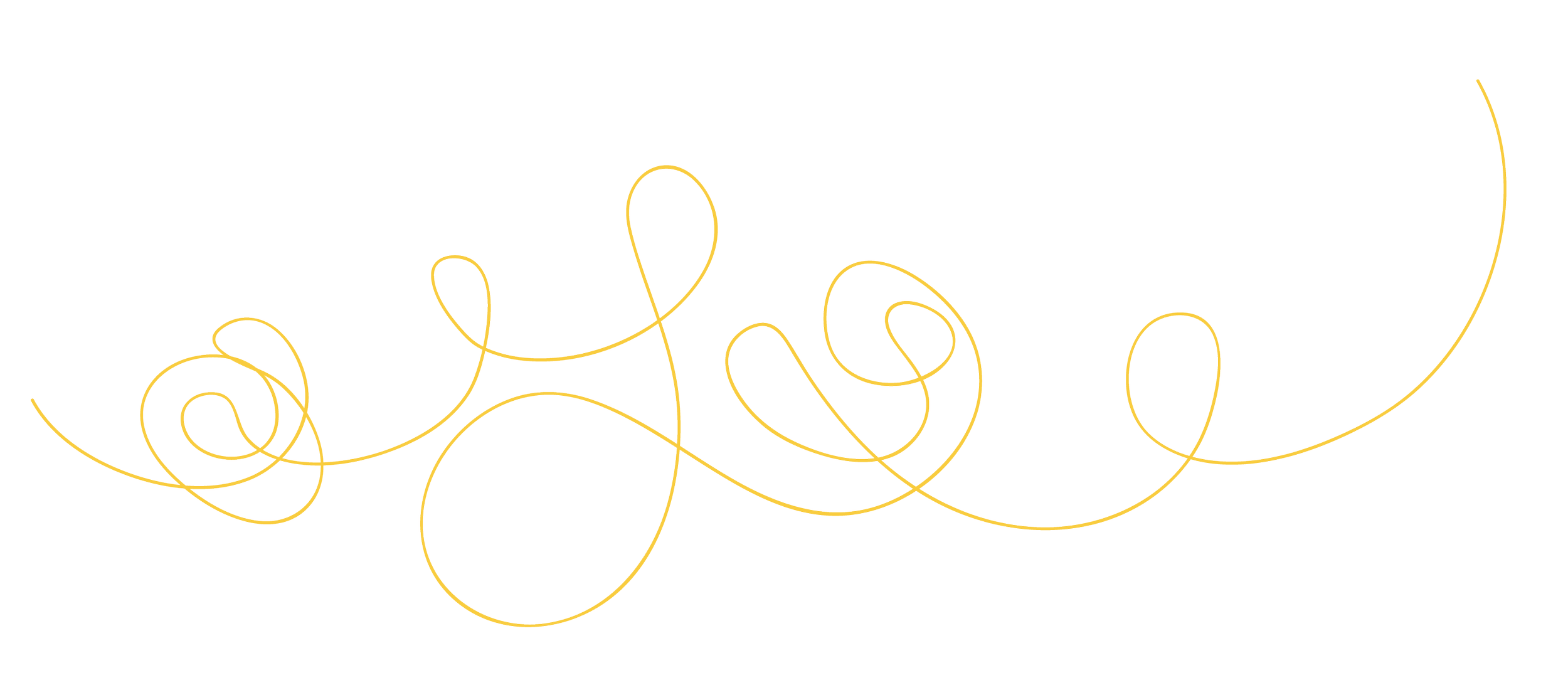
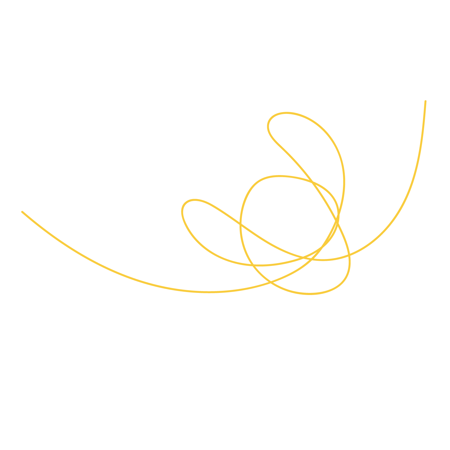
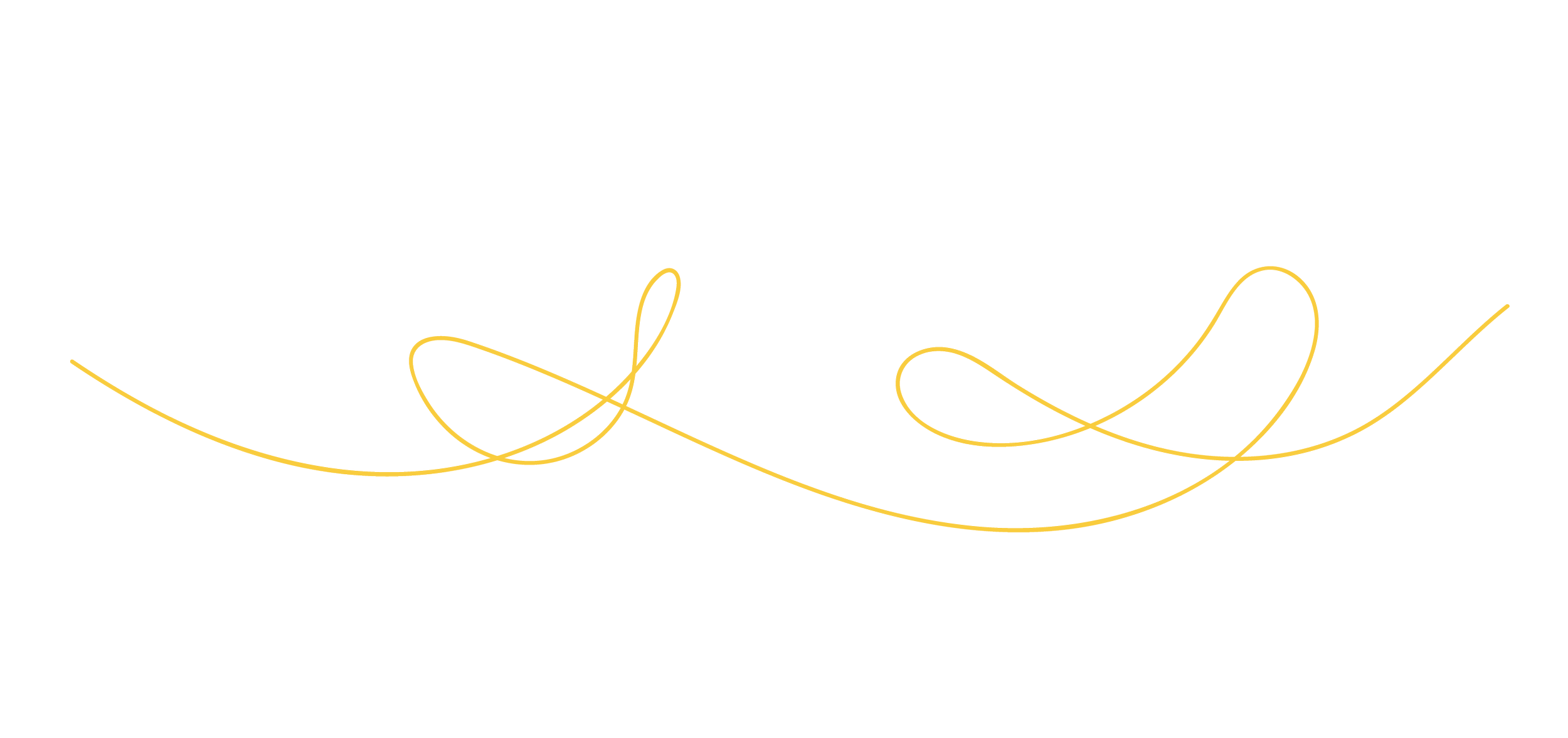
Illustrative designs were always considered since the ice skates’ blades and rollers created marks and imprints on the floor and ice, which created a permanent feel of someone’s skating career and journey, which Edea aligns with the progression and permanence of the skaters that use their products.

line designs interconnected like a skating program when skaters leave their skate marks on the ice.Unlocks more creative uses for the brand, leading to flexible changes and unison for the brand.


Illustrative
Line Designs
Illustrative designs were always considered since the ice skates’ blades and rollers created marks and imprints on the floor and ice, which created a permanent feel of someone’s skating career and journey, which Edea aligns with the progression and permanence of the skaters that use their products.
line designs interconnected like a skating program when skaters leave their skate marks on the ice.Unlocks more creative uses for the brand, leading to flexible changes and unison for the brand.

international shipping
box for boots, blades, and other accessories
blades only
Edea’s packaging system is decorated with elements of line designs to convey what type of products are inside the packages abstractly.
Packaging Design

Skates are generally expensive, so creating a packaging experience that allows users to enjoy the grand scale of the products was considered to highlight the elegant side of the brand and sport. Depending on their usage, skates last from 6 months to several years, so creating an experience for the customers was integral to the branding process.
Customer Experience
Displays brand unity and connection with the line designs and skaters’ marks on the ice.
Creates a detailed and developed customer experience for the grand, expensive products they provide.


A simplified web design version was created to help complete Edea's full rebranding. A more modern and elegant approach strengthened the brand's cohesion.
Web Design
Better unity and visuals to showcase the brand and its products for ease of customer experience.


The branding of the advertisements ranges from abstract, utilizing typography and illustrative lines for a Swiss-style design, to the integration of recognizable figure skaters and roller skaters who use their skates to advertise their products.
Posters
Utilizes brand elements to create brand cohesion and resonate with the potential new audiences for the skates.
LOOKING AHEAD
Retrospective
HOW COULD THESE DESIGNS HAVE BEEN IMPROVED?
With more time, maybe an expansion of the project can be created by creating a retail store pop-up design for the brand to showcase more ideas for the customer experience and brand unity.


These older designs were from a packaging project earlier on before the rebranding process, redesigning the packaging design of Edea. Inspirations came from the skaters and the location of the company itself.Various illustrative styles were considered to help convey a more sophisticated look for the brand. The older designs were from a packaging project before the rebranding process for the senior course seminar, redesigning the packaging design of Edea. Inspirations came from the skaters themselves and the location of where Edea was made, in the Alps of Italy.
The “What if(s)?”

Personal Experience—My initial ideas for this came from my own experiences and my peers regarding this product and brand. Hearing their opinions on the skates' positives and flaws led me to tinker with the possibility of rebranding Edea, especially since they’re known for their visually stunning skates.
Doodling & Illustrating— Incorporating my first love of drawing and figure skating made me realize it would make sense if you could create and justify a reason for implementing a brand design. However, it definitely involves communicating and presenting why it works.
Opening-the-Box Experience—Working on this project, I’ve realized how important the experience of opening the box is. It becomes another way for the brand to cement its customers' loyalty and create an appreciation for the dedication of the brand’s identity and values.

Explorations and development of the project were created due to my love for ice skating and the years spent poured into my competitive and recreational journey of figure skating. Without passion and knowledge of the products/brand I’m designing, it wouldn’t be as developed of a project as it was now.