YouTube Live
YouTube has become the central hub for video watching and content creation, and recently, its live section. However, the existing UI for YouTube Live is not as prominent to push live streaming to the forefront compared to its competitors. By modifying its UI and visual layout for live streams, we can better promote the live stream side of YouTube.
YouTube (concept)
2 months
2025
UI Designer

OPPORTUNITIES
Expanding the YouTube Live
YouTube encourages short content with constant uploads, yet there’s a missed opportunity to connect to the community to harbor and grow for creating longer content. This is to encourage YouTube as an all-encompassing video platform with range from short to long-form content.
Challenge
Make the UI of YouTube Live more prominent and consistent throughout the platform to encourage more live content.


Figma video walkthrough of the YouTube Live to showcase the consistent Live UI on the profiles and thumbnails.
Video Walkthrough
FAMILIARITY
The live feature shows when a content creative is live, yet there isn’t a noticeable marker on the thumbnail of the video. Using the space where the time of the video occupies, it creates a sense of familiarity of where to look for certain key elements. The time stamp and “Live” being synonymous with time was one of the main reasons for changing the location of the Live button.
Live Features

(Old) Youtube live ui
(new) youtube live uiCreates familiarity by having pre-existing spaces occupied by new UI elements for the Live stream counterparts.

(Old) Youtube videoMISSED CONNECTION
The live feature on the profile picture disappearing after clicking on the video creates confusion among the user, since the only notable UI element to indicate that it’s live is the whole red bar and the small live icon next to the sound icon. Keeping the live feature on the profile picture helps indicate that the live is still happening, while also being more visible and familiar to the user.
Live Features

(Old) Youtube live from content creator's livestream
(New) youtube livestreamCreating a consistent UI across all parts of the platform by keeping indicators the same for visual layout.
VISUAL DIFFERENCE
Compared to ongoing livestreams and upcoming ones, I sought to create more differentiation between the two to create quicker scannability aside from just the timestamps being the visual indicator. Adding a darker, lowered opacity layer for the upcoming livestreams helps indicate that the videos isn’t available yet and is unclickable.
Upcoming & Current Lives

(Old) Youtube page for content creator's live page
from upcoming livestreams, current livestream, and vod
(new) youtube Page with content creator's live Page
from upcoming livestreams, current livestream, and vod
Creates a better differentiation visually while developing a quicker scannability for the type of videos readily available and upcoming, while maintaining a consistent UI placement.
EXPLORED OPTIONS

To encourage the livestream section of YouTube, adding the live button among the shorts, subscribed YouTubers, and the home and explore page encourages the realm of livestreaming to users and puts them in the same content creation category for all creators alike.
Navigation Bar
(Old) Youtube navbar layout
(NEW) Youtube navbar layout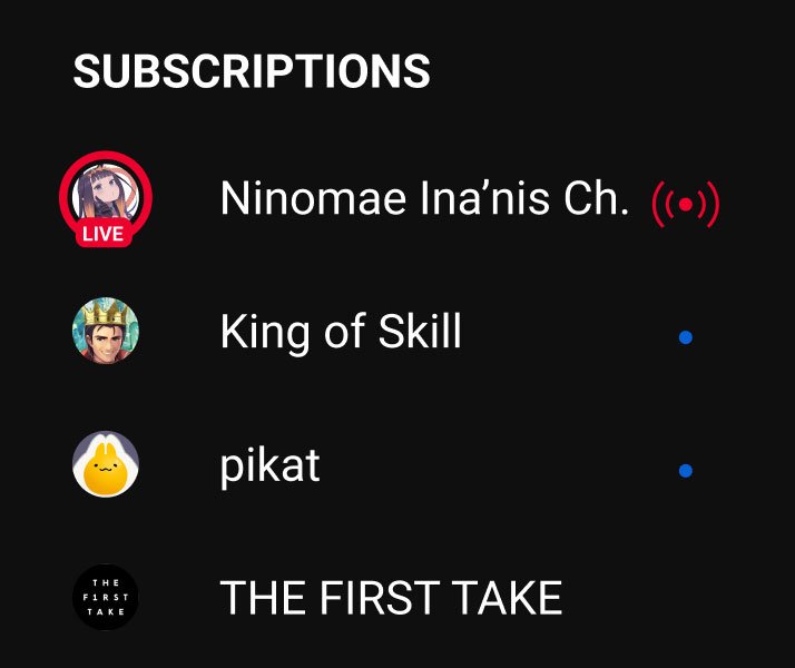
(NEW) Added live profile ui element with live icon to make it more prominent that subscribed youtuber is liveEncourages the exploration of different aspects of YouTube and the many realms of creators, from content creation to livestreaming.
LOOKING AHEAD
Retrospective
HOW COULD THESE DESIGNS HAVE BEEN IMPROVED?
Since it’s more of a small passion project, given that I use YouTube a lot and dove deep into the live-streaming world, the main problems were only addressed to showcase a more streamless, visual outlook for YouTube.
Understand Usability— After the Google UX Design certificate course in Coursera, I understood the user’s experience and interaction more across the digital space. With the added lens of users and how to go about problem-searching and solving, I was able to navigate how to go about refining and adjusting the designs to better meet users needs for efficiency’s sake.
Project takeaways.
Simple Explorations—I wanted to explore revamping YouTube since I use it quite a lot and love it. I thought it would be an incredible experience to do a quick project to explore the possible problems and solutions for a market YouTube seems to haven’t tapped into yet compared to its competitors.